
Unexpected Error. Please Investigate.
Spoken like a true machine, these impersonal messages - you know, the ones that provide absolutely no clues or context whatsoever - used to be standard.
Luckily, in terms of UX, things have got much more personal these days. Like the palm-sized Noisy Cricket in Men in Black - small but potent - modern brand's have a powerful weapon up their sleeves: microcopy.
Much more than a witty error page, microcopy is helping organisations surprise, reassure and connect with their audience. Here are five brands that use tiny words to make much larger statements.
#1. Revolut - your functional friend
Revolut’s microcopy is so good that, at first glance anyway, you wouldn’t even know it was there.
And that’s the point.
According to Alejandra Rodriguez, Copywriter at Belatrix Software, good UX microcopy is invisible; it helps guide users to complete an action without them realising it’s happening.
“In filmmaking, an invisible montage shows such a fluid sequence of events that viewers are not even aware that they are actually watching fragments of recorded images and sounds. Ideally, they perceive a fluid, coherent story that makes them forget they are in a movie theater. The same can happen with good microcopy that supports a fluid journey,” she said in UX Writing: Creating Microcopy That Speaks to Users.
In the same way that good web design feels clean and natural, interface microcopy that works doesn’t demand your attention; it earns it quietly.
“Customers need not spend much time reading text or understanding button labels. They just follow the visual path that UX designers and writers have created for them,” says Rodriguez.
For this to work, writers need to have the same in-depth understanding of a persona’s pain points as UX designers do. All the while keeping a consistent brand tone, take a look at how Revolut changes tact when talking to individuals and businesses.

Every statement, whether it’s a product benefit (“get more from your money”; “no hidden fees”) or social proof (“Join over 15 million revolut customers”) has been used to reassure the customer. Even the CTA isn’t pushy (Revolut opt for a much softer “Get Started” over something like “Sign up”).
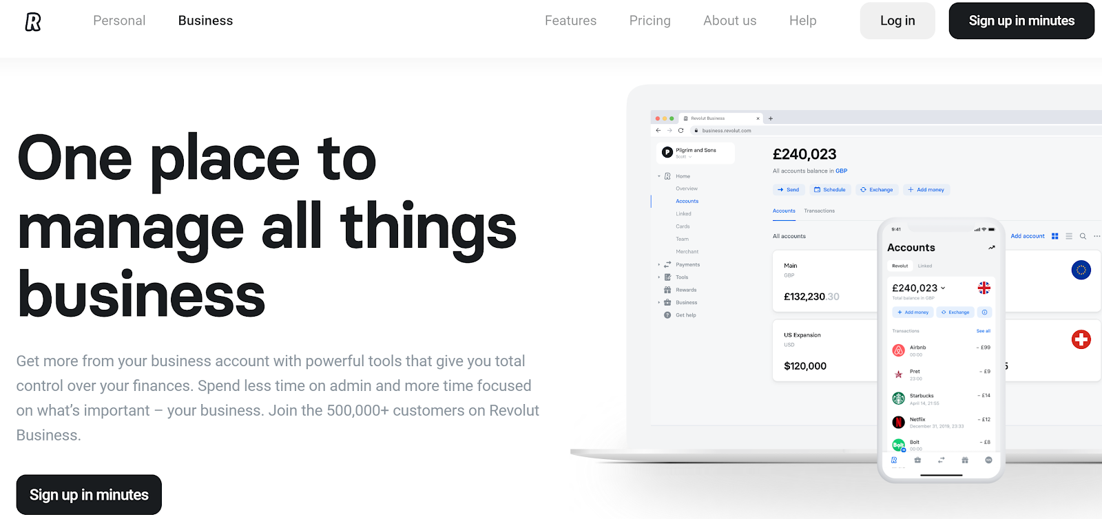
Although Revolut are still friendly and familiar when talking to businesses - like Monzo, they position themselves as a challenger brand to the traditional corporate bank. And for businesses they’re targeting a different pain point: time. While the individual may feel untrusting or unsure, businesses need a solution that works and want to get moving ASAP. The “sign up in minutes” CTA seems simple and unassuming - but that’s the genius of it.
#2. Dice - copy to broaden your horizons
When microcopy’s done right, it eases fears and taps into emotions. But like any good form of communication, it needs to consider the context as well as the customer to work.
“Microcopy is extremely contextual. That’s why it’s so valuable. It answers a very specific question people have, and speaks to their concerns right on the spot,” said Nick Babich in Microcopy: Why Tiny Words Matter.
Ticketing app, Dice, is a great example of how to do this well. Instead of bombarding customers with unnecessary emails, they use their comms to reassure and inspire their audience. Each email is light on copy but every word serves a purpose.
Take their comms before, the day of and after a gig for example...
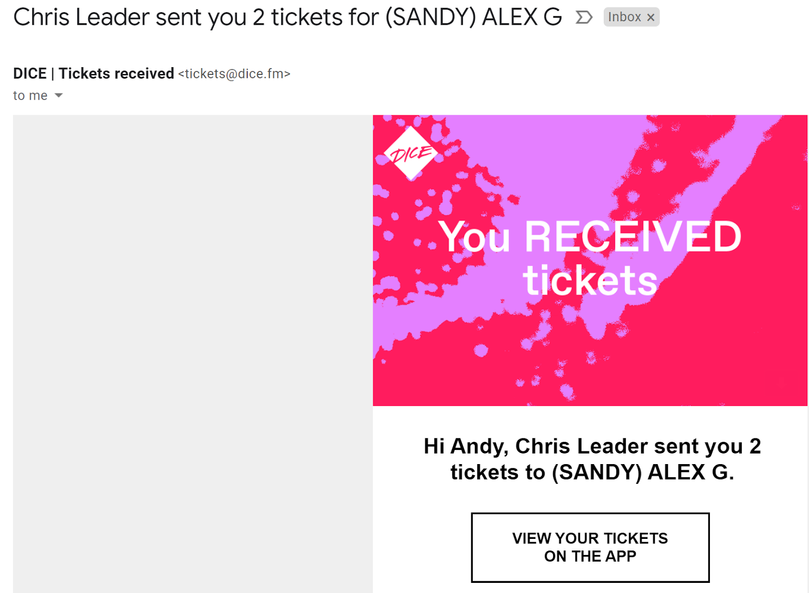
Before I even had a chance to worry “how does this work?” Dice have got in touch and reassured me that my tickets are safely inside the app.

Again, I didn’t have a chance to fret and text my mates about printouts, etc. In a few snappy sentences, they’ve cleared this up for me too.
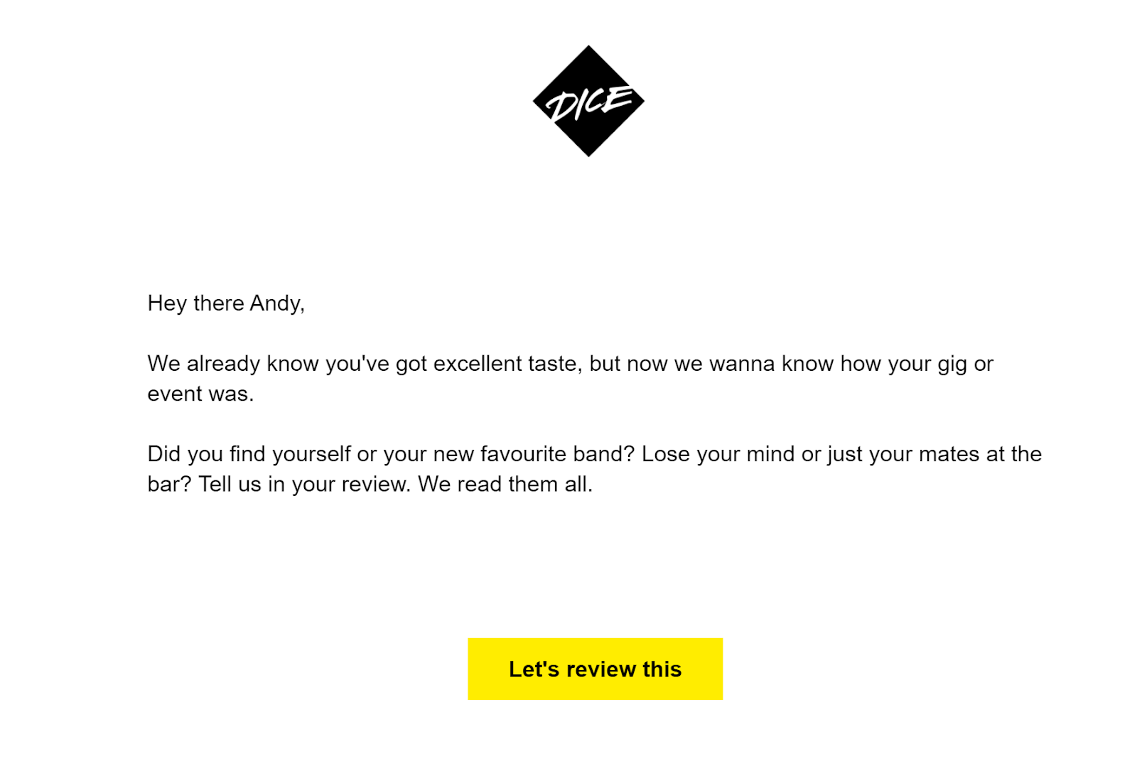
Flattery will get you everywhere, Dice. But seriously, conversational microcopy in the right context has the best chance of converting. They know their audience are musos who have blogs, contribute to publications or, at the very least, like talking about music. “We read them all” is a nice precursor to the “Let’s review this” CTA and makes you feel like it might actually be worth writing one.
#3. Domino’s - slicing through the spam
These days, we’ve become so hung up on user experience “signals” and satisfying search engines, that it’s easy to forget why UX is a ranking factor in the first place. Basically, it makes sure that the internet is functional and, in the right contexts, fun for users.
Sure, “dwell” time is important for SEO. But design a great user experience, whilst adding a little flavour into your copy and people are going to want to stick around anyway.
This is something that Domino’s are doing well.
Whether or not Dom the Pizza Tracker actually works in real time is up for debate - Jessica Lindsaty recently investigated this for The Metro - but its captivating UX design and microcopy can’t be denied
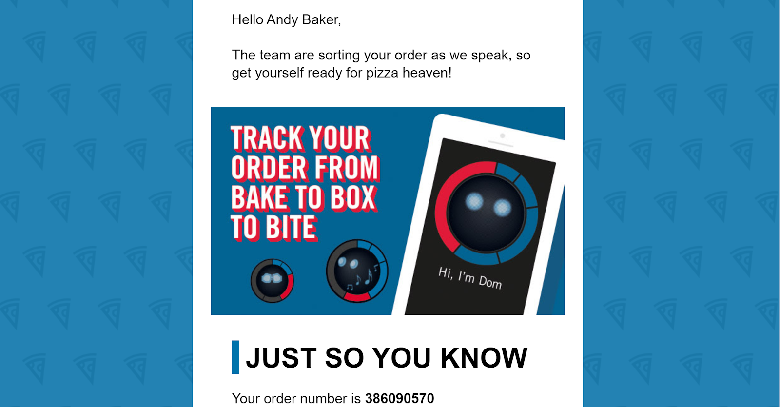
Now, you wouldn’t use Dom to tell a customer that their pizza’s been burnt or sent to the wrong house - context is always key. But in helping to build anticipation, the timely witticisms of this animated wheel feel second-to-none.
In his book Designing for Emotion, Aarron Walter argues that we judge products, apps and websites by the following criteria: how functional, reliable, usable and pleasurable they are.
The Domino’s app works so well because, beyond its functional objective of telling you where your pizza is, it makes you feel good using it.
#4. Bumble - prose that levels the playing field
In The Four Cornerstones of Writing UX Microcopy, writer Sheena Lyonnais suggests microcopy “... is a puzzle” consisting of four corner pieces:
- Brevity - their time is limited so be concise.
- Context - be transparent so they can make informed decisions.
- Action - help them fulfil their purpose (search, learn, buy, etc.)
- Authenticity - build trust by empathising and being yourself.
No stranger to puzzles themselves, dating app Bumble has mastered the art of keeping users “playing” with their UX design and microcopy. But they don’t just use their words to keep users hooked; Bumble’s an app that understands what’s at stake for their users. Just look how they put all of those four puzzle pieces in place:

Brevity in action: Bumble explains their whole business proposition and what makes them unique in two, succinct lines. What’s more, they don’t force users into signing up with their CTA; far from a pushy date, they pique your interest and let you decide.

Context and authenticity: In this small amount of real estate, Bumble has both set the scene and established themselves as a trustworthy brand that’s shaking things up for the better.
Just goes to show, you don’t need to write a sonnet to get your point across. Not when a haiku packs just as much punch, anyway.
#5. AppSumo - empathising with entrepreneurs
“When it comes to apps and websites, the best microcopy should make the user feel as if they are communicating with a real person rather than just a digital interface,” says Yuval Keshtcher, CEO & Founder of the UX Writing Hub.
Sounds simple, but talking like a human doesn’t just keep you on brand, it makes you feel a hell of a lot more approachable too. Pretty important when you’re looking to attract customers, right?
AppSumo has got this down.

In the age of automation, a personal touch goes a long way. AppSumo are speaking directly to cash-strapped entrepreneurs and founders - and they’re doing it like a real person.

AppSumo’s CTA on their partner page invites you to “Start selling”, while its microcopy alleviates any fears you might have about the fees. Great microcopy is intuitive; it feels like it’s reading your mind.
The 5 C’s of compelling microcopy
It’s easy to take call-to-actions, search bars and notifications for granted - they’re tiny after all. But whether it’s subscribing to, buying from or simply coming away feeling good about your brand, the smallest messages that can lead to the biggest moments. With that in mind, consider these 5 C’s when before writing a word of microcopy:
- Always consider the context: your tone of voice might be lighthearted and playful but sense check whether you’re making the customer laugh or yourself. There’s nothing funny about a missed delivery or a payment that’s gone through twice.
- Be concise: it’s microcopy for a reason. These words should compliment design - not over power it.
- Imagine you’re having a conversation: good microcopy can reassure users that there’s a human behind the brand. So talk like a human - not a bot.
- Communicate with your designer: don’t wait to rewrite the lorem ipsum - sketch and scribble together. You’re both trying to solve the same problem after all.
- Bring creativity into your copy: it’s not all functional; in the right scenario, microcopy can surprise and delight. So, put as much personality in the small print as you do your podcast.
After all, it’s the little things in life that matter most - right?